
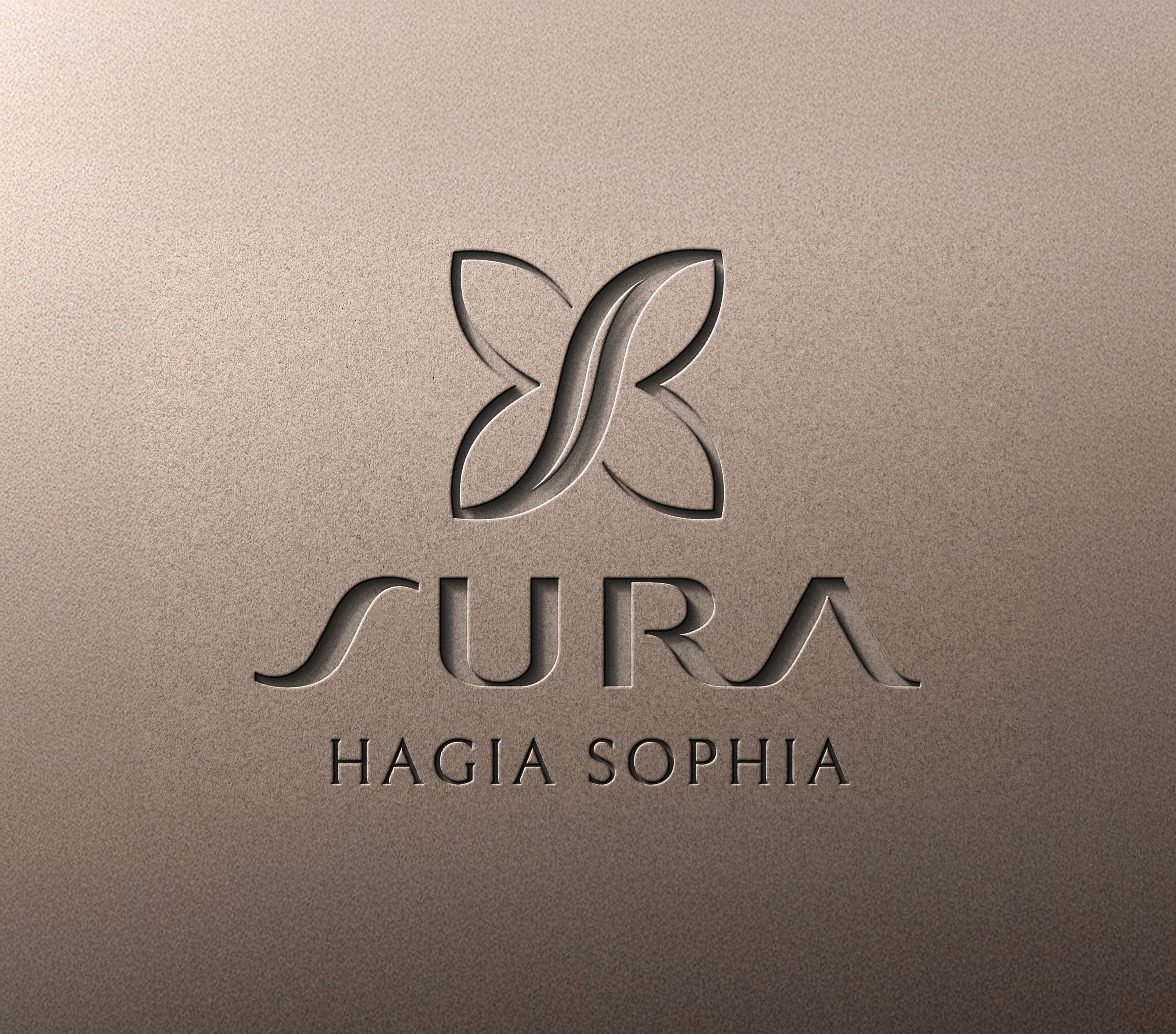
SURA Hotels Brand Identity
The brand identity work was developed for SURA, a five-star hotel group based in Istanbul. The name “Sura” signifies the purest and most exquisite form of silk. Drawing on the word’s meaning, the core visual element of the Sura identity is a butterfly form that has been evolved into a modern, sophisticated mark. This mark serves as the primary identifier, representing the brand consistency across all platforms.
The application of this mark—from signage and social media to three-dimensional objects and posters—is meticulously detailed in the brand book to ensure identity and consistency are maintained throughout every touchpoint.
To convey an experience of comfortable and luxurious travel and accommodation, the brand emphasizes the feeling of the silk’s softness and the flight (ethereality) of the silkworm across all media. This seamlessly links the brand’s name to the feeling of an elevated, gentle, and opulent stay.
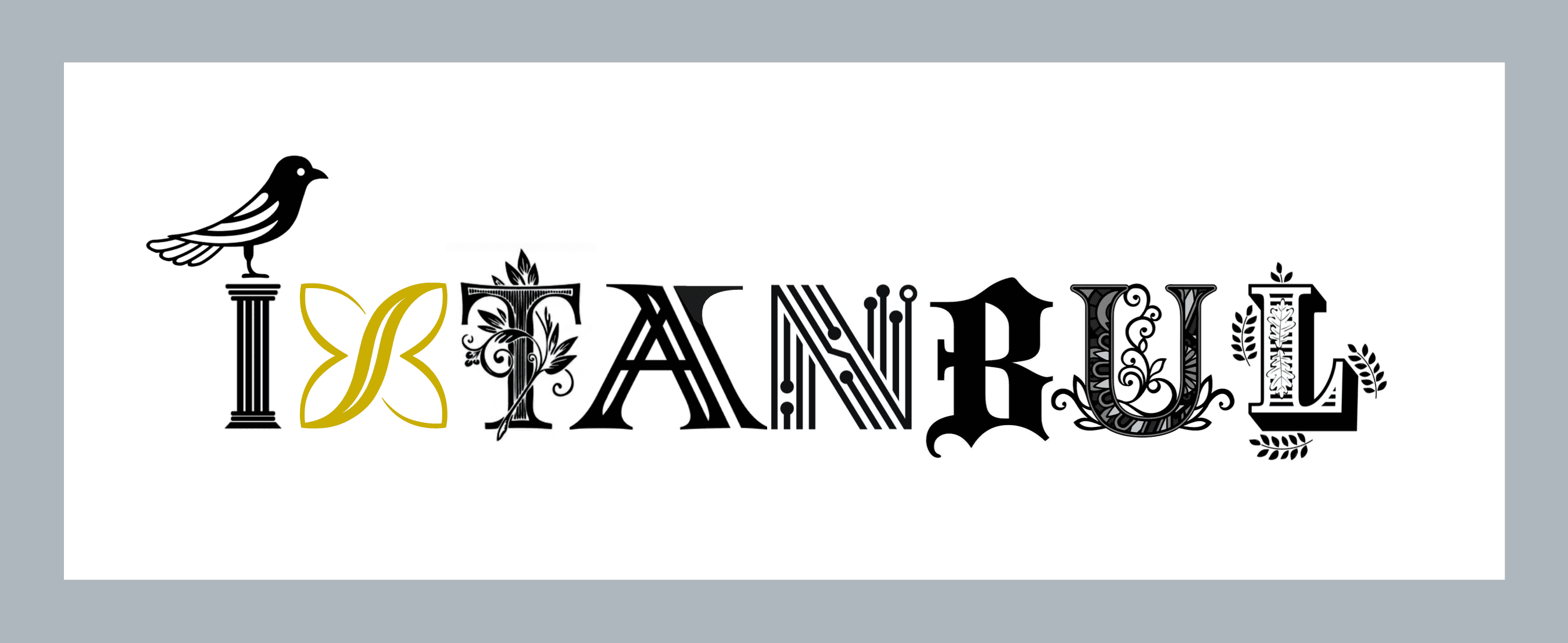
Poster for Sura Hotel
A poster designed for Sura Hotel in Istanbul, highlighting the city’s layered cultural history through expressive typography and symbolic illustration.
The composition brings together iconic architectural, natural and calligraphic details, creating a bold visual celebration of Istanbul as the home of the brand.
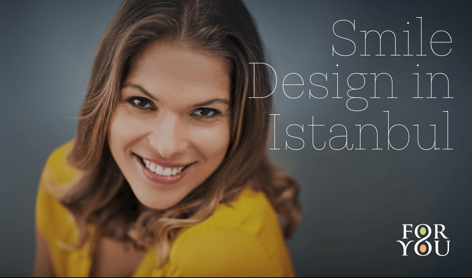
Brand Identity For FOR YOU Health Tourism
“Healthy and aesthetic, forever.” This is the ethos of For You, one of Turkey’s pioneering brands in health tourism. In 2023, Brandomızıka undertook the corporate identity project that resulted in For You’s new icon and logo. This symbol performs flawlessly across all media and platforms, immediately providing the brand with the advantages of the corporate trust and brand perception it aims for in its initial customer impressions.
Crucially, For You succeeds in maintaining a consistent identity and visual aesthetic across every platform and medium—from signage and posters to social media—without ever descending into visual clutter or complexity. The brand presents a unified, impactful image everywhere it appears.
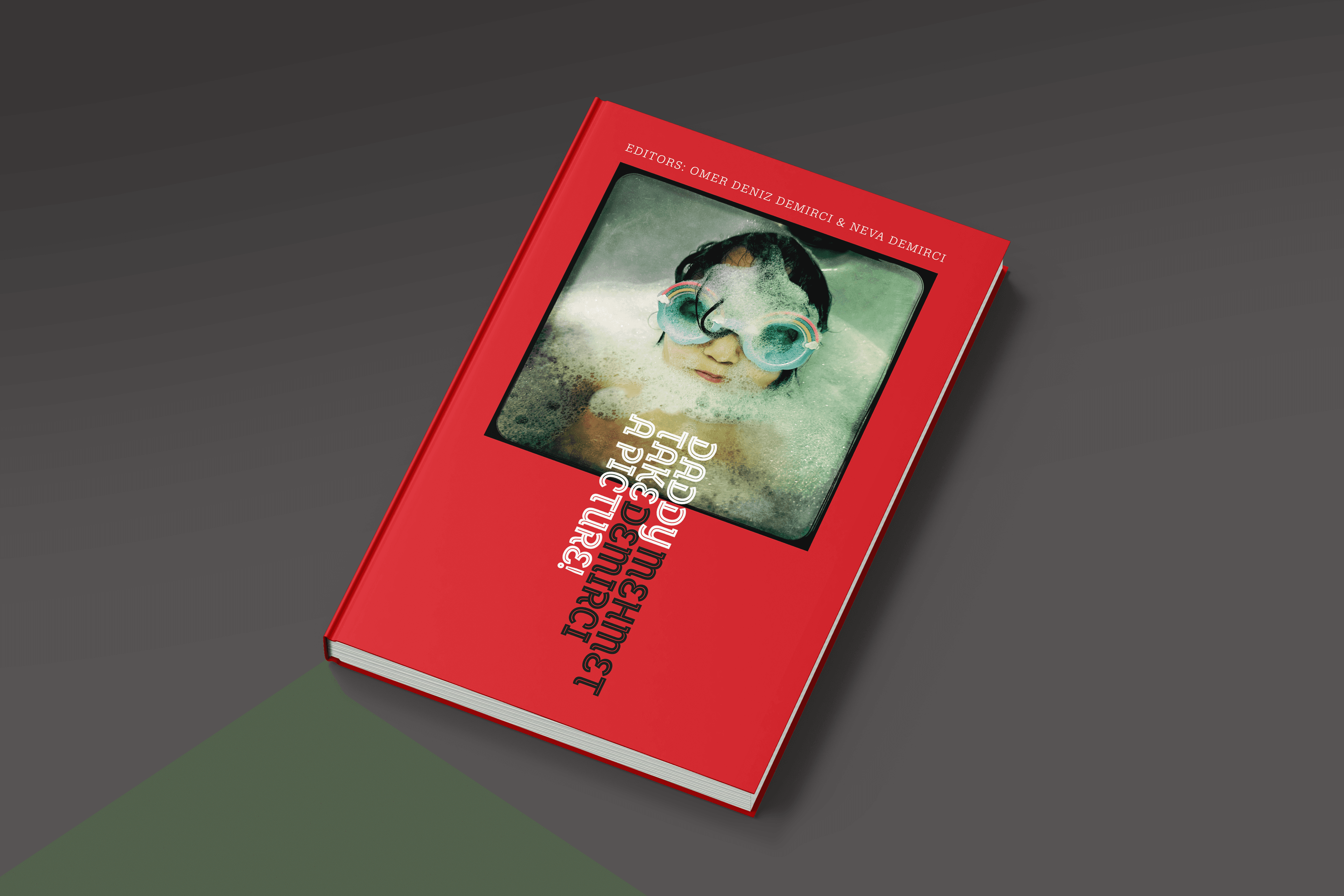
Book Design For “Daddy Take a Picture” project
The project features photographs taken by Mehmet Demirci, one of Turkey’s leading photographers, during his travels with his children. The book compiles a total of 40 photographs taken across 11 countries.
The design is unique: the pages unfold in an accordion format within a single plane. Furthermore, thanks to perforation along the spine of the pages, they can also be easily detached and used as postcards.
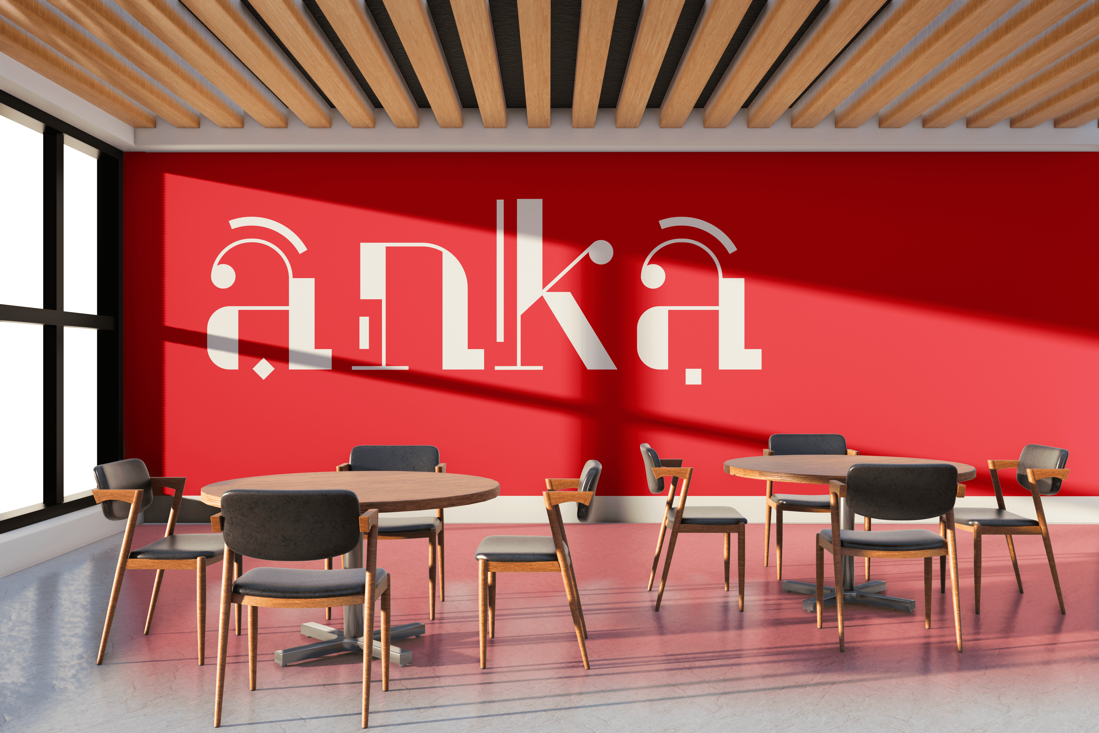
Logo design for Anka Cafe
A logo design crafted for a next-generation café where young people not only enjoy food and fun, but also engage in cultural experiences. Created for a brand serving the Turkish community in Germany, the concept blends the visual DNA of both cultures through bold, typographic expression.
The identity was built to carry motion and energy, reflecting a vibrant lifestyle that’s always alive and always in action.
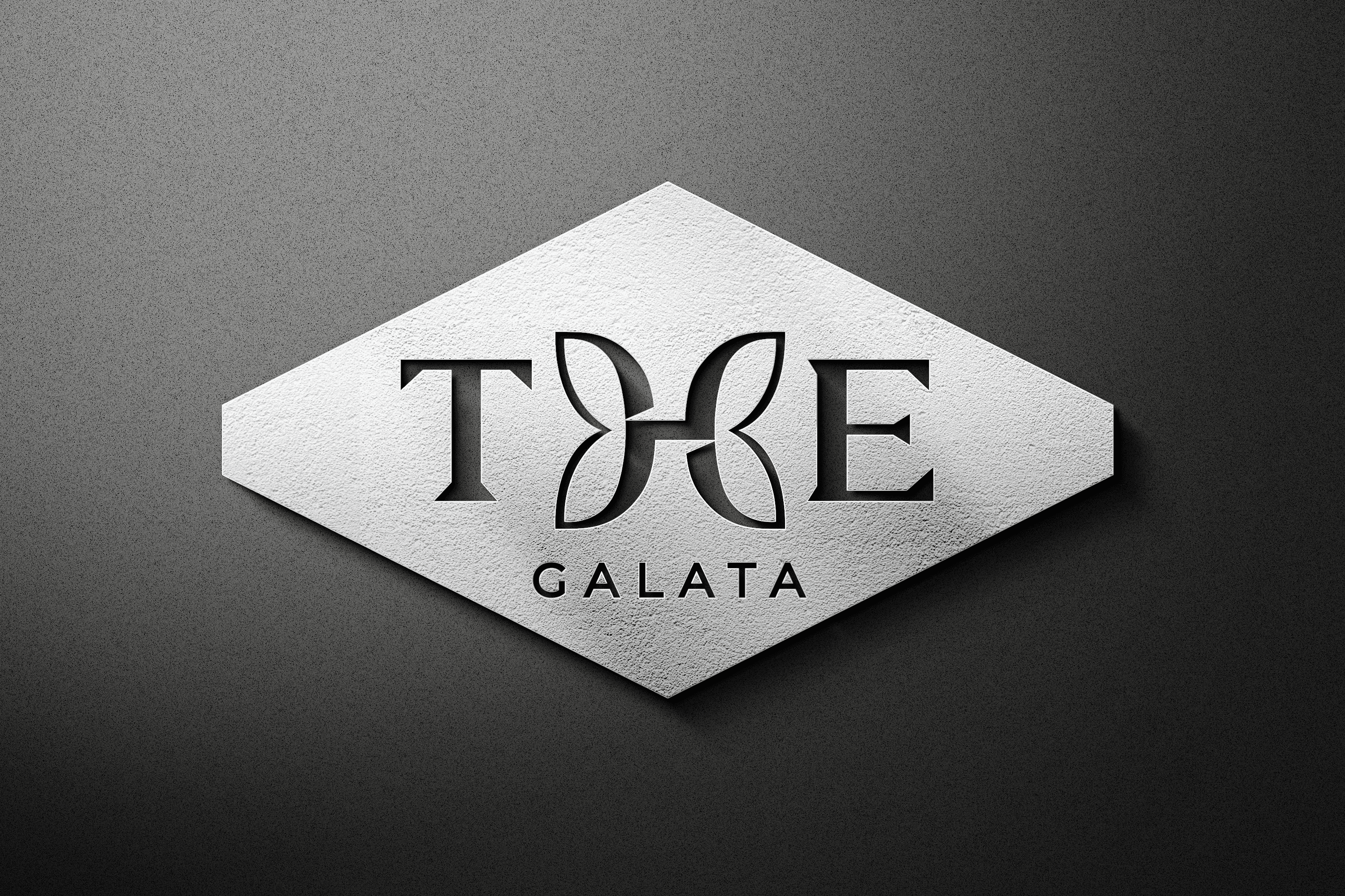
Brand identity design for THE hotel
Designed around the playful character of the word “THE,” this hotel invites guests to the vibrant heart of Istanbul’s cultural capital, offering tailor-made experiences in the city’s most inspiring setting.
By sculpting the anatomy of the letter “H,” the identity subtly mirrors the butterfly form of its sister brand, SURA Hotels. A classic serif typeface enriched with sharp, modern details gives the brand a distinctive look that feels both timeless and contemporary.
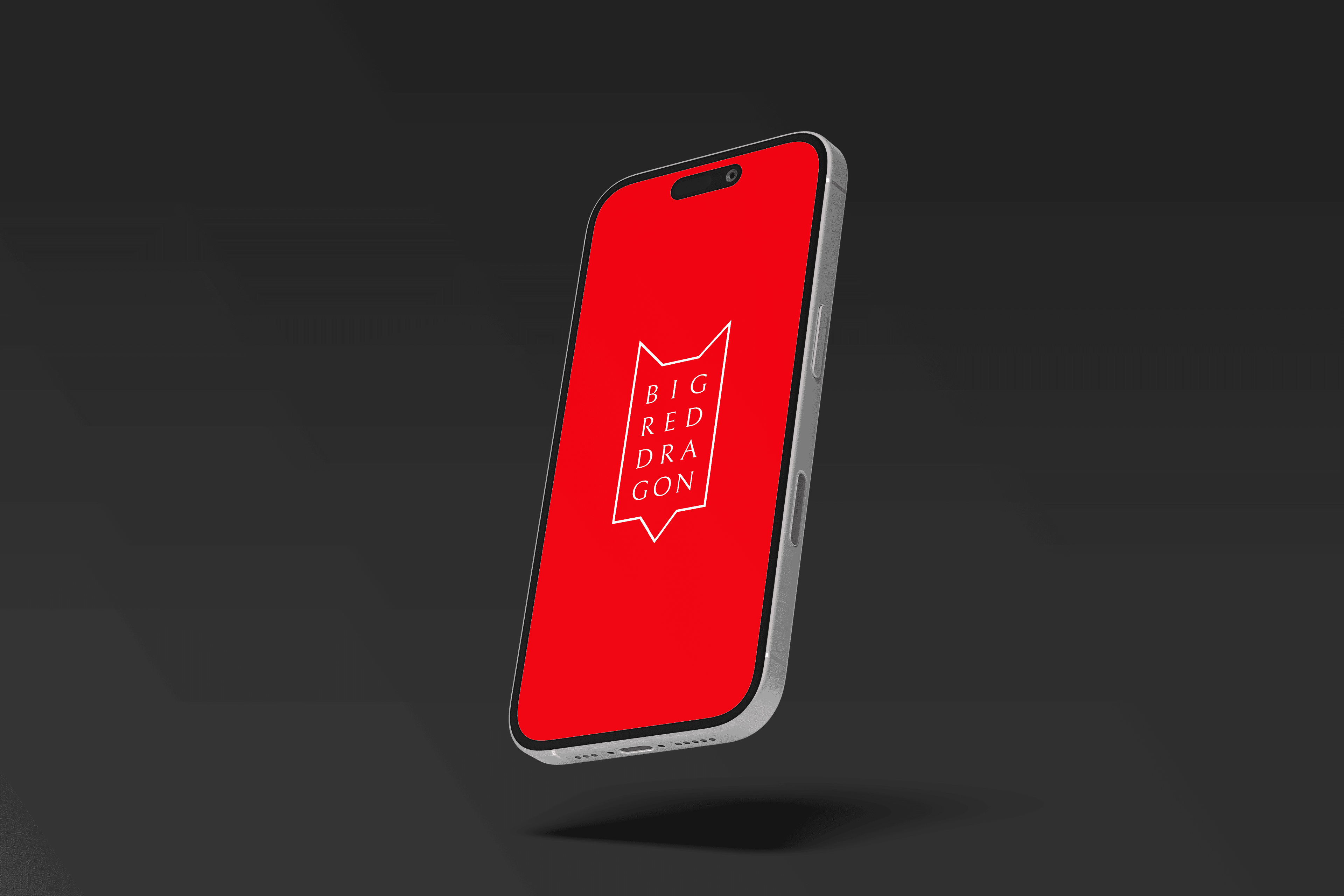
Branding design for BigRedDragon
Big Red Dragon is a creative agency rooted in digital marketing, transforming brands through bold strategies that keep pace with evolving media and ever-shifting consumer experiences. Based in Istanbul, the agency embraces innovation at its core.
The brand identity began with a sleek, modern and minimal dragon abstraction, with typography seamlessly integrated into the form. The result is a distinctive and highly adaptable visual mark that performs powerfully across every platform.
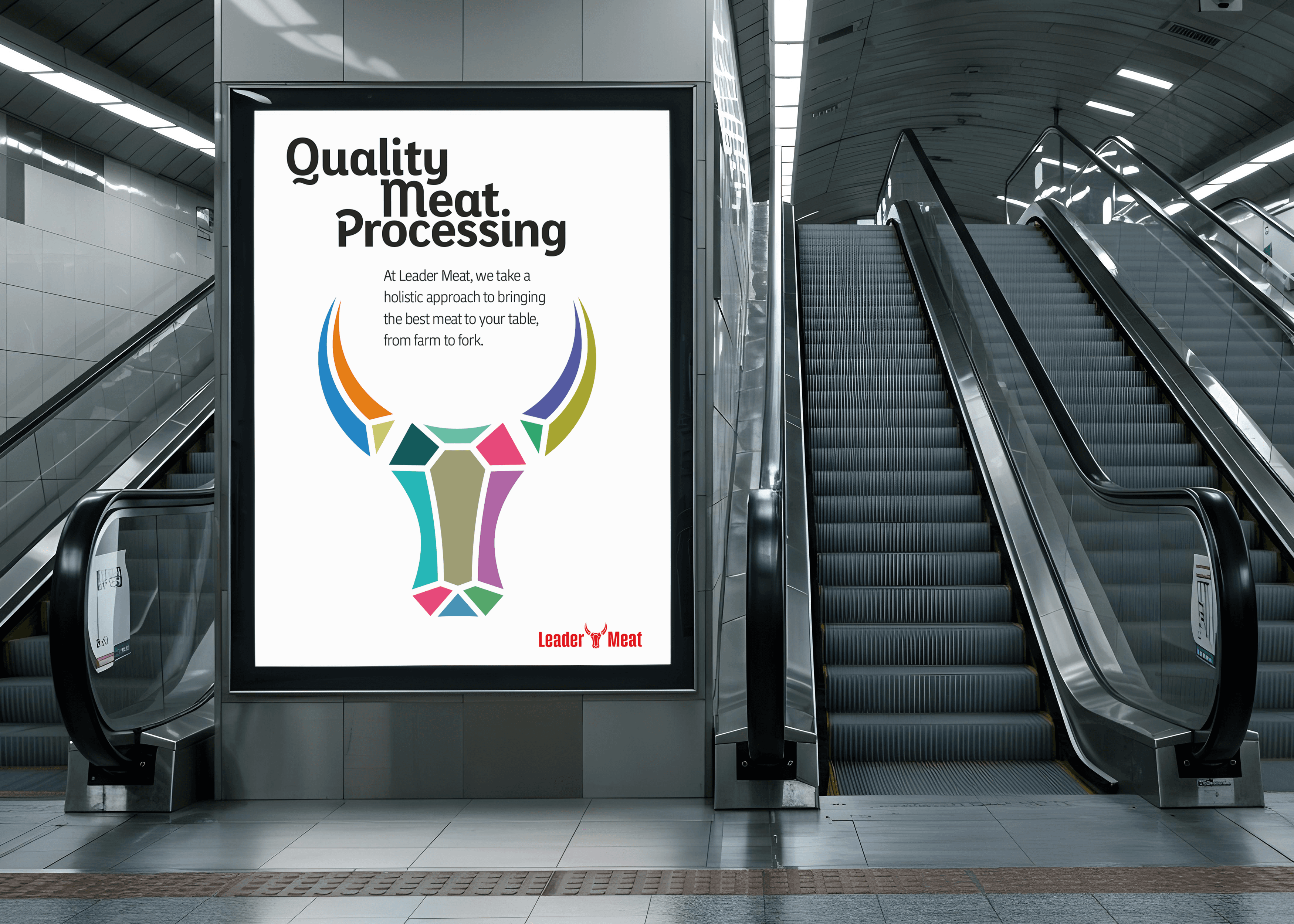
Brand identity and poster design for LeaderMeat
Leader Meat is a livestock farming and meat supply company established in the United States. Driven by the belief that “meat delivering such great flavor shouldn’t look dull or brutal,” the brand moves far beyond the usual slaughterhouse identity.
Leader Meat shifts from the typical rough and intimidating visuals of the industry to a colorful, charming and smile-inducing brand world. The result is a cohesive identity system applied across every touchpoint, from social media to poster design, making the brand as delightful to see as it is to taste.
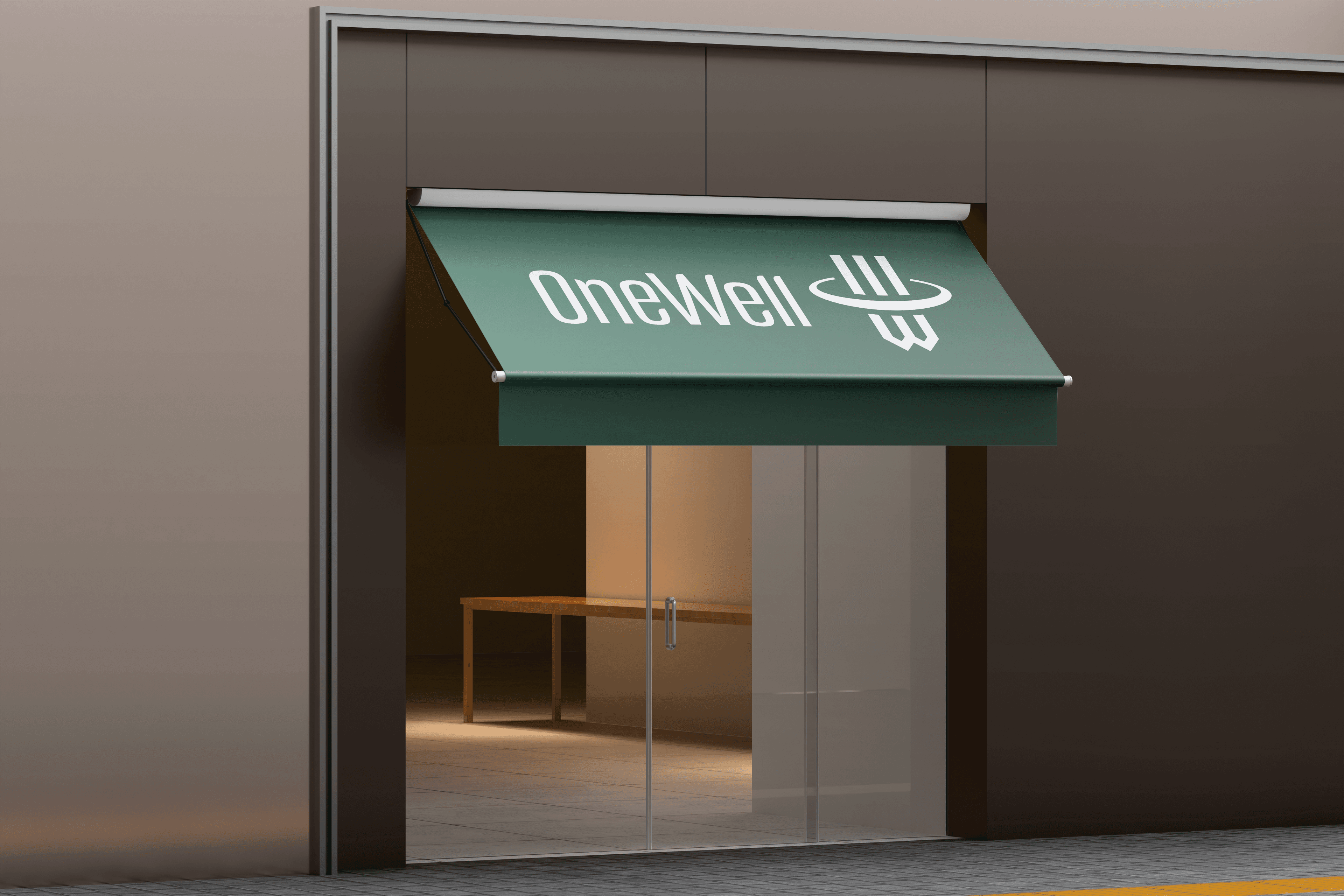
Logo design for OneWell finance company
One Well is a standout project in the international finance sector, recognized for its fresh perspective. The logo highlights modernity and corporate trust, incorporating the iconic column structure that supports buildings into the core anatomy of the mark.
The circular ring shaping the letter “O” symbolizes transitions between financial processes and seamless connection across transactions. A confident vertical typography paired with a refined green palette brings the brand’s identity to a polished, future-focused finish.
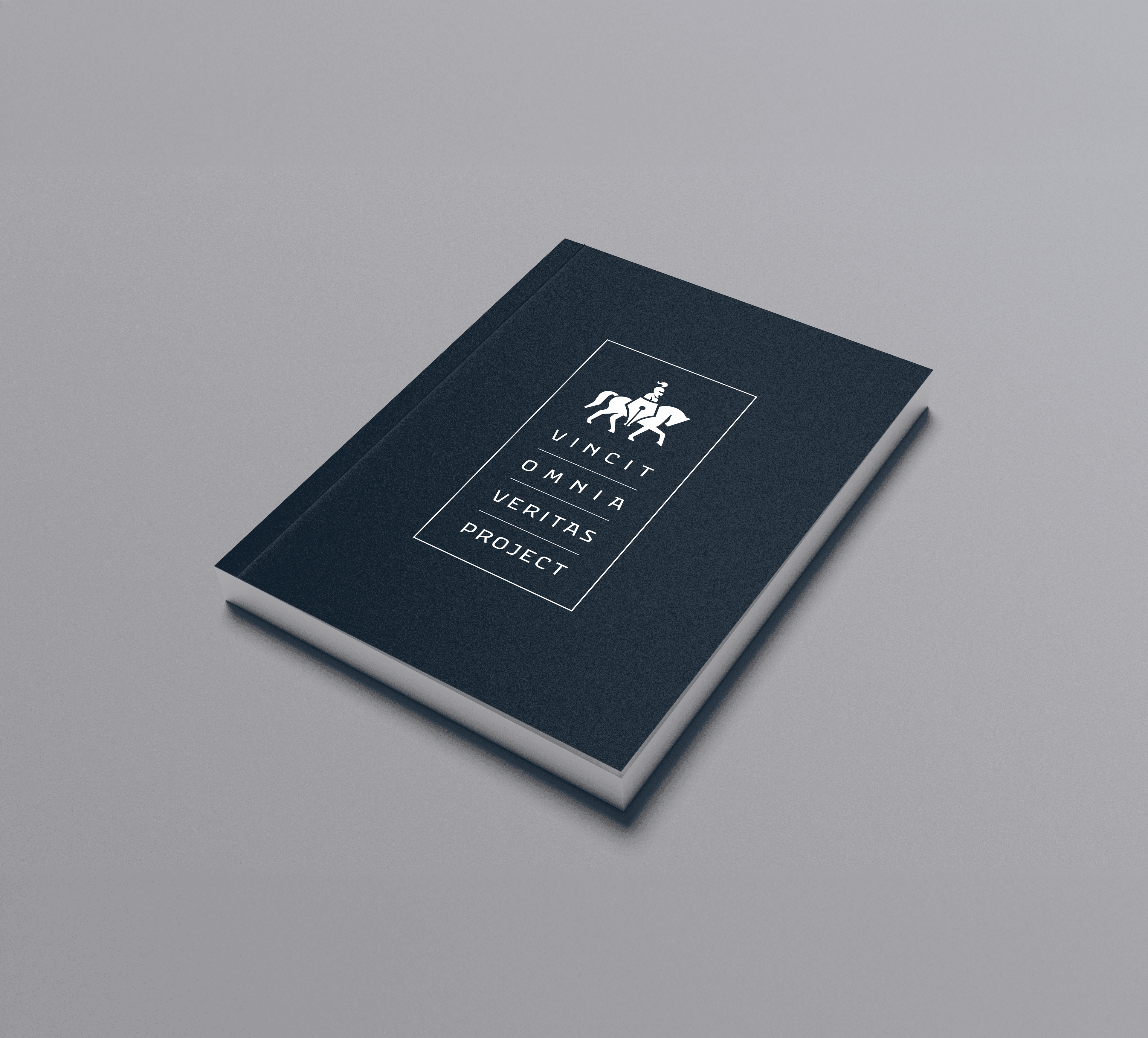
Logo and book cover for VOV Project
“Vincit Omnia Veritas” is a purpose-driven project created to raise and strengthen public awareness that truth, sooner or later, always leads to better outcomes for everyone. No force can hide the truth forever; it inevitably comes to light.
Those who attempt to profit by burying facts often face the opposite of what they intended. The logo unites the pen, symbolizing thought, with the shield, representing strength, to form a striking emblem. The defense of truth can be a remarkably powerful thing.
“In The Beginning, There Were Letters” T-Shirt Project
What you wear has never spoken so clearly about who you are. Clothing is now a part of communication itself. Born from this idea comes a T‑shirt design project shaped around the origin of expression. Before the word, there were sounds. Before sounds, letters.
“In The Beginning, There Were Letters” is a creative initiative where letters transform into new visual forms, evolving into greater ideas over time. Its purpose is simple yet bold: helping people express themselves more freely, one letter at a time.
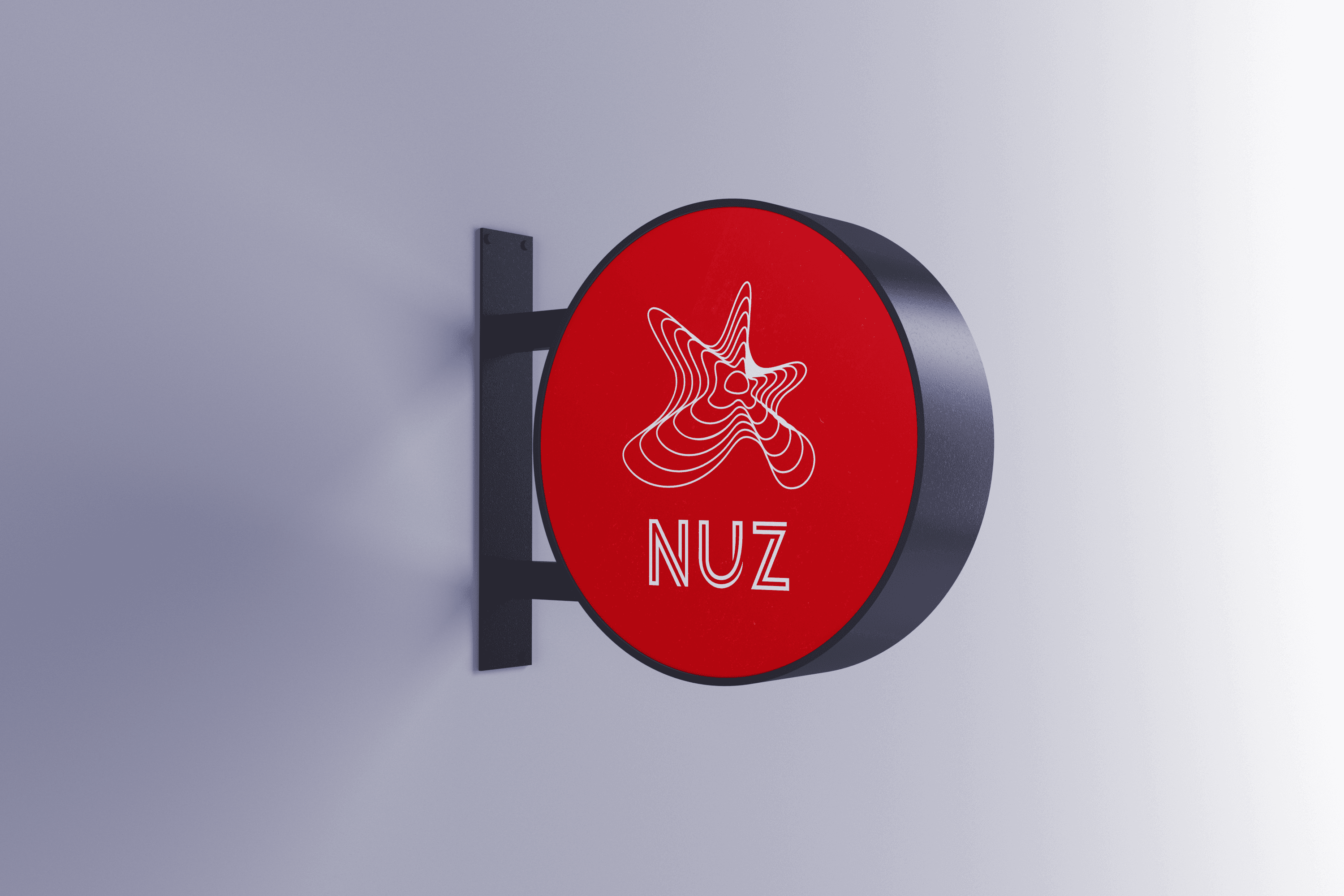
Brand identity design for Nuz Restaurant
NUZ is a premium steakhouse restaurant in Istanbul’s historic Sultanahmet district, where centuries-old local flavours meet contemporary culinary craft. With its refined atmosphere and unmatched location, it offers an unforgettable taste experience for guests seeking an extraordinary adventure.
NUZ stands proudly among the stars of great flavor, which is why its logo takes the form of an elegant, interwoven star symbol—capturing the brilliance of exceptional dining at every glance.

Brand Identity For “Cyber Threat Worth Stopping” Project
“Cyber Threat Worth Stopping” is an awareness project focused on educating and empowering everyone against the growing dangers of the digital world. From governments to everyday families, cybersecurity has become a shared responsibility that can no longer be ignored.
The logo features a Wi-Fi symbol cleverly transformed into an umbrella, representing protection from every cyber storm. A simple reminder with a powerful message: stay aware, stay secure.
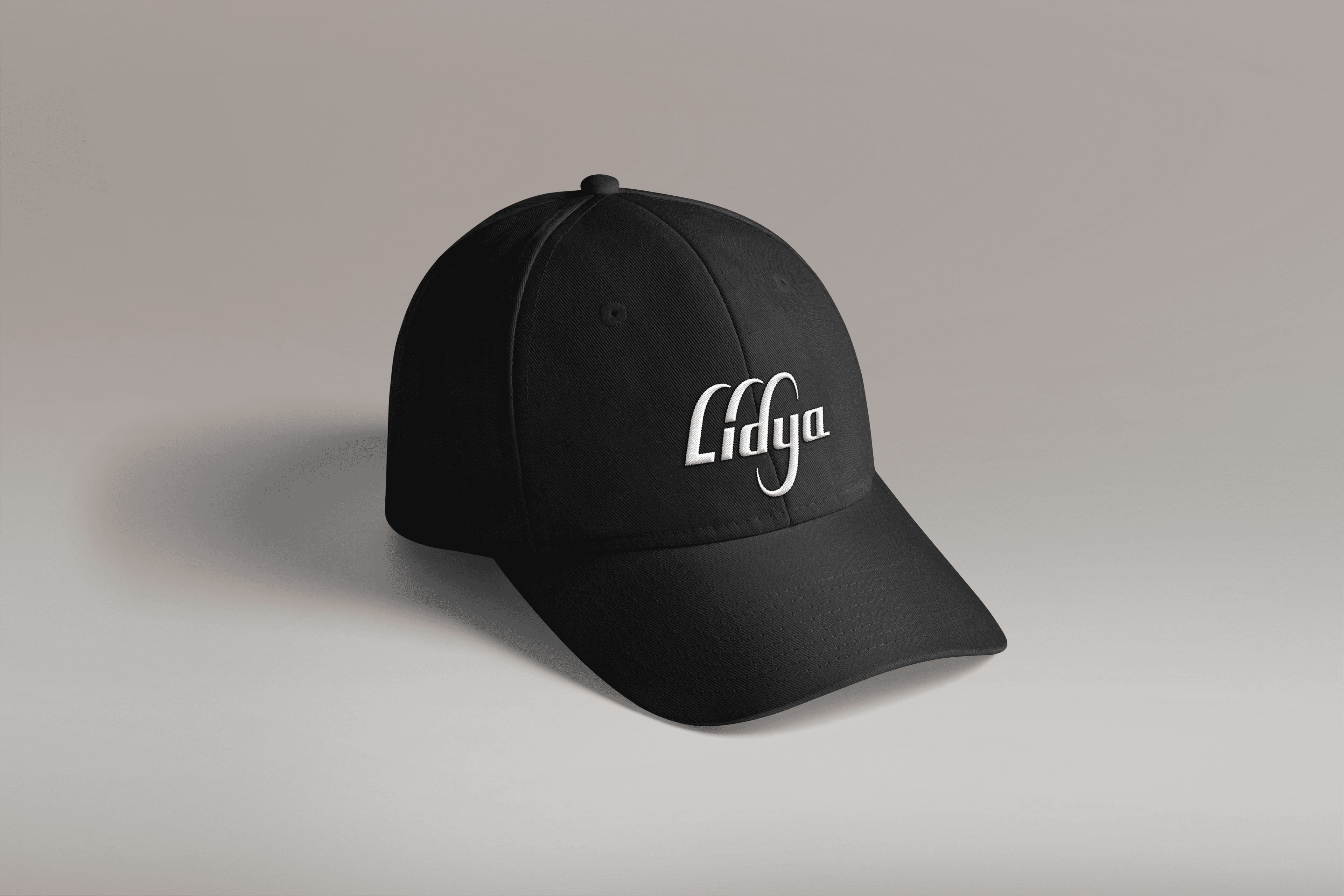
Logo design for Lidya foreign trade company
Lidya is founded on the pulse of global trade. Our logo translates the unseen routes of international commerce into an infinite, flowing action, continuing through the very letterforms.
Brandomızıka ensured this identity is perfectly reflected with unwavering consistency, from the logo design to the merchandise, even down to the cap.
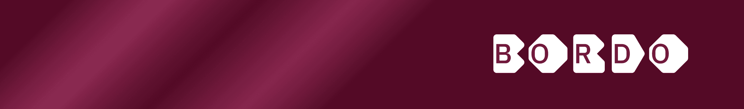
Logo design for Bordo real estate company
BORDO, a real estate firm based in Istanbul, rejected the sector’s tired clichés of roofs, keys, and houses. Instead, the logo—designed by Brandomızıka—features a sleek, modern capital font nested within a thick, handcrafted, futuristic typeface.
This typographic solution elevates the fundamental human need for shelter into an artistic statement. Brandomızıka has, once again, leveraged the sheer power of typography to forge a truly unique form and meaning.
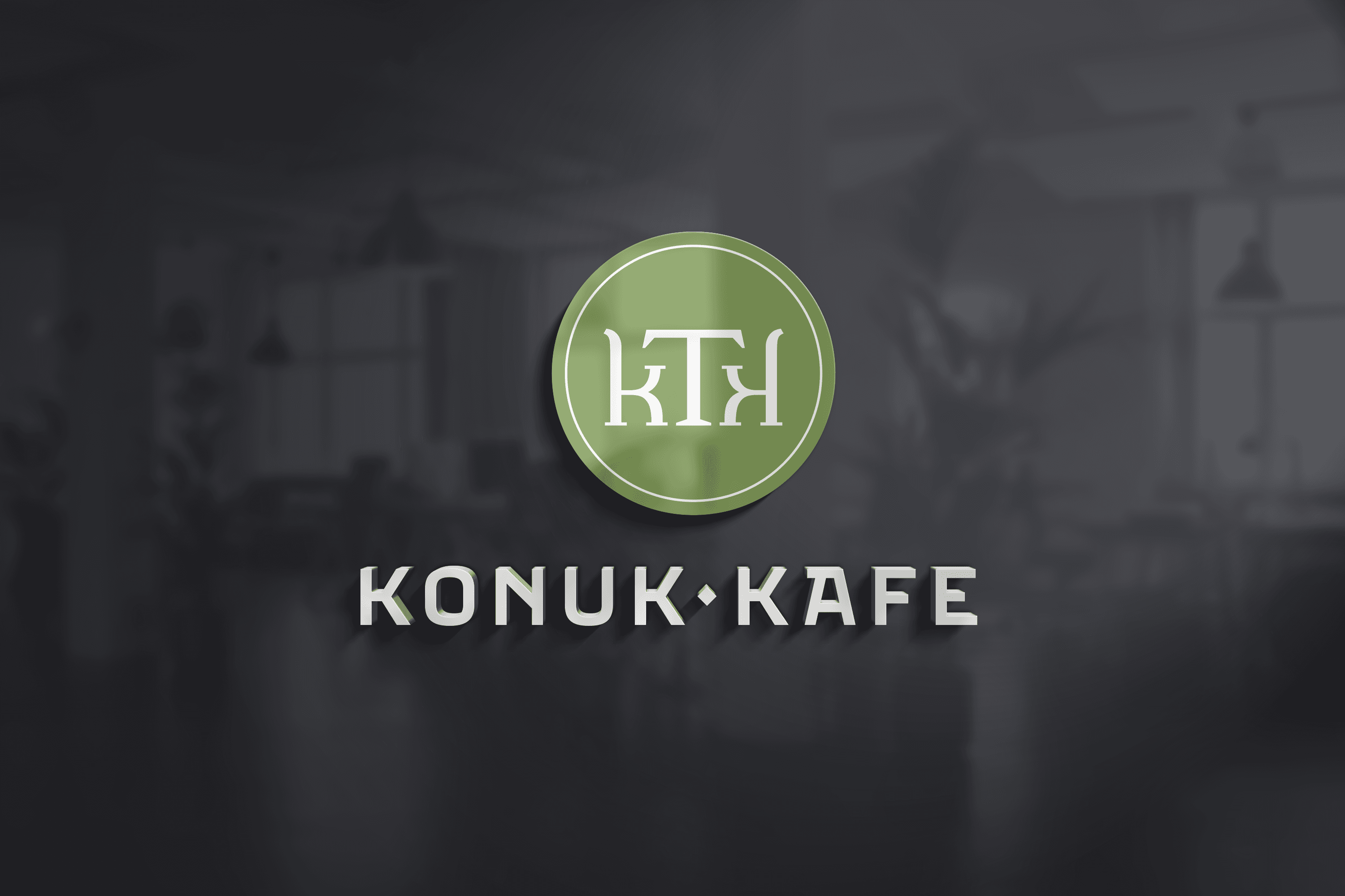
Logo and sign design for Konuk Kafe
Konuk Kafe is designed to challenge the limits of hospitality, offering guests a profound sense of warmth and belonging. This isn’t just a coffee shop; it’s a third space—a sanctuary for socializing, extended stays, and even remote work.
Our logo captures this spirit typographically: the letter “K” transforms into a cozy armchair, and the “T” becomes a tabletop, creating a genuine, intimate picture of two people meeting in conversation.
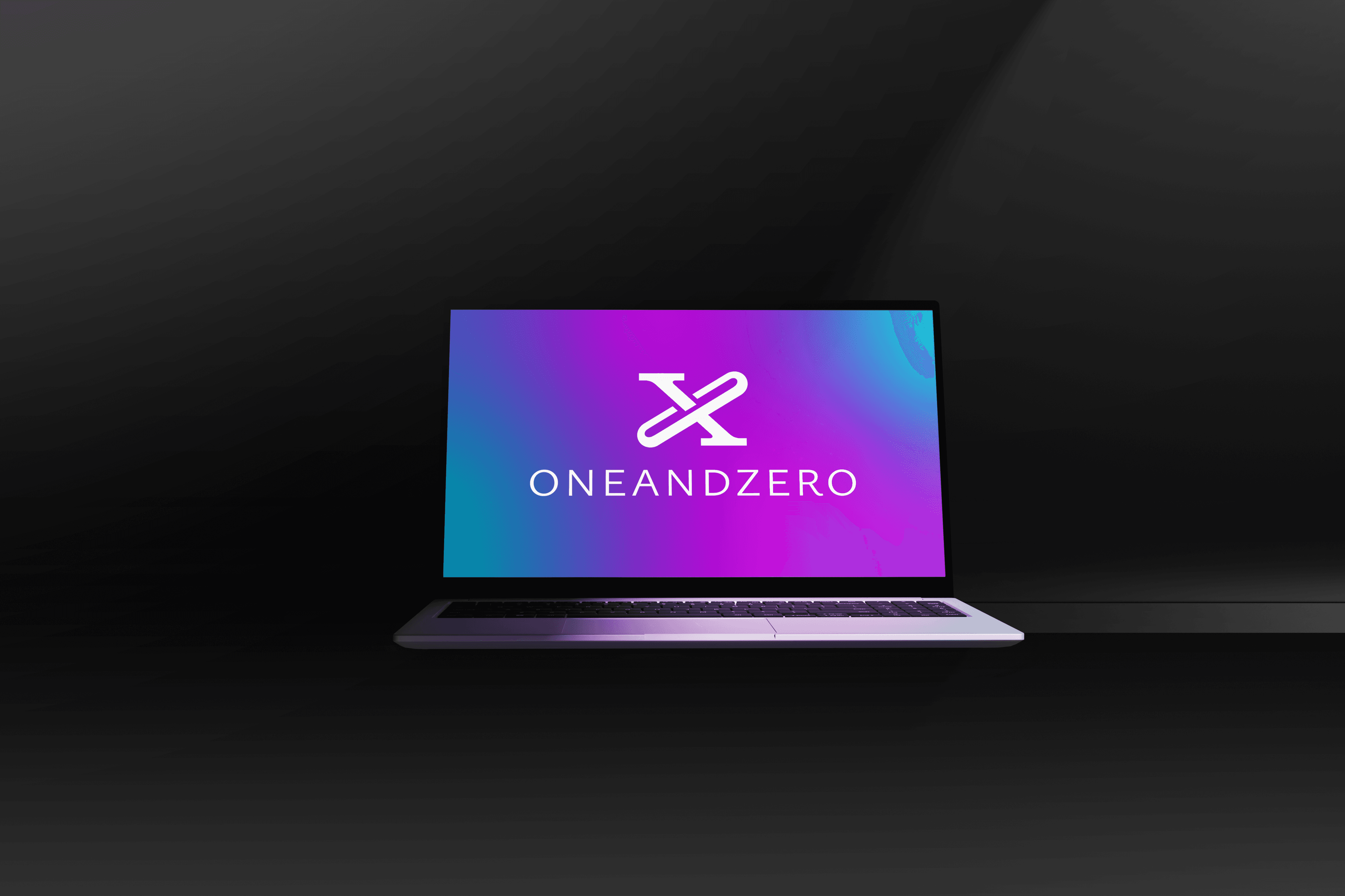
Logo design for ONEANDZERO
The world is in flux, and human habits are rapidly evolving. In this dazzling environment, ONEANDZERO stepped forward to offer clients the cutting edge of digital marketing, positioning itself as a symbol of agility and innovation.
The name itself is a cryptic form of the number 10. Brandomızıka carried this progressive vision into the logo by interlocking the figures “1” and “0” in their Roman forms. The resulting mark—an “X”—is also the Roman numeral for 10, creating a unique, versatile, and powerful symbol. With the typography eliminating all spacing to form ONEANDZERO as a single block, the identity becomes a visual wink to clients seeking both clarity and creative magic.
Anel İş Merkezi, Joker Ofis, Yamanevler Mahallesi, Site Yolu Caddesi, No:5/4 34768
Ümraniye, İstanbul, Türkiye